Tuesday, July 19, 2016

Group Project

http://andywheeler23.wix.com/pickledome
WEBSITE

Our company is called Pickle Dome. It is a local company that sells products and services related to the sport of Pickle Ball. Locally located and serving the diverse age ranges of young students who play outdoor sports to the retirement community who already are fond of this low impact sport.

[ Pickleball is a sport  that combines elements of badminton, tennis, and table tennis. Over the past few years, pickleball has gained a huge audience and is blowing up everywhere. Pickledome is your newest premier pickleball shop that is guaranteed to take your skills to the next level. ]

_______


I was assigned the objective of creating a Logo for our company which would adequately describe our company's fun and laid back local nature.  I then had the assignment of creating a style guide to create continuity between group projects.

In Logo design client feedback is imperative in coming up with the ideas, shapes, colors and feel that will eventually come to be the finished logo. For this assignment I mentally categorized my fellow study group members as the client. Their input on what would be our company's visual identity was key, and was also very important to their work as they would have to put that logo into each of their product designs as well. Brand recognition = Brand awareness = repeat customers.


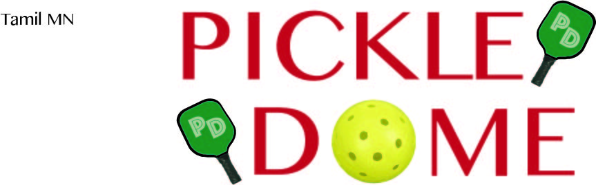
I initially created sketches for this product that were a mixture of literal dome and pickle imagery and more simple visual balance generated by the letters P and D, p and d. While each of these ideas had merit, the group input I received indicated a preference for the last idea on my sketch page. It features the two words Pickle and Dome with paddles for the game and a substitution of the letter O as an image of a pickle ball. We chose a group of colors to work with that basically meant tennis court colors; clay red, court green and court blue. Not specific until I found images to take color samples from.

So I had a logo idea to go through, with an idea of what the finished project would look like. Time to design.

My thinking on the design was that it would by necessity be scale-able, able to be placed on many different articles and products in order to be useful to the company in creating brand identity. To make this work, I chose to use the graphics program of Adobe Illustrator. Its ability to place type and shape in mathematical vectors makes it agile in scaling up or down in size.

_______

I now needed visual elements


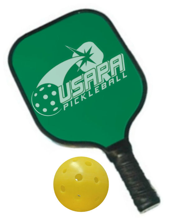
These images I found online were to be essential elements with which I would construct my final logo. I would take the colors and shapes of these two pictures and turn them into scale-able vector images that would provide visual interest and help to explain at a glance what our product is within our logo. The top image is a paddle and ball that are used to play pickle ball. The bottom image is a hollow plastic ball with holes in its sides sometimes called a wiffleball or in this case a pickleball.
Visually simple images that represent the sport/lifestyle we are attempting to sell.

_______

Now for colors.


These two images I found of the sport of pickleball delivered the colors I needed for our logo and style guide. I sampled the greens, blues, reds, and yellows on display and picked those that worked well together on a white background. Contrast being key to legibility and brand recognition.

_______

Prototype phase: what works in the designs and what does not.


Picking brand fonts is a challenge. While picking ours I happily stumbled upon the font Phosphate and fell for it as a visual element in our logo. The idea that the white lines on the colored letters visulally referenced the lines and colors of a tennis court was perfect to my sense of visual thought recognition. I presented these images to the group with their visual differences and asked what people thought. The immediate response was positive and favored the font I liked and the colors of the second image but with the more squared off second line of the third and fourth choices. The dome and paddle on the second line are made more square with the first line using kerning between characters. The P and D were to be dropped from within the paddles as the group did not like the cluttered look of them. Color was preferred over black lettering.

_______


I then presented these four images to the client and asked for final input as the time was running out on what was needed before they could implement  the logo into their products. The second and third images have the colors swapped for the words with green on top and red on bottom, the third has black outlines outlines around and inside the letters, the fourth has the inner white line removed and a court blue background. The first choice was favored over the others. No other changes were needed except making sure the lines would be white all the time, not clear so that the color of the medium on which the logo was printed would show through.

_______
I presented this final image to the client in a wide variety of file formats so that they could make it fit into whichever programs they were working on, including PNG format which has transparency wherever there is no defined color instead of white background.


_______


Lastly I created a style guide to unite this logo with the information of its construction as well as a list of fonts that would be acceptable to our company's visual style. I completed it with a list of colors as well as their designations on the CMYK RGB and HEX numbering systems. I provided visual representations of the fonts in use within the font category at the bottom.


_______


Annalysis

When analyzing the logo by itself I came up with a number of ideas using the gestalt principles of design. I wanted the logo to be visually striking, with a dynamic placement of letters and images that would be memorable and fun.
A balanced top and bottom works to promote a sense of visual strength and harmony. The weight of each line is the same due to kerning on the bottom. The contrast of the warm red over the more cool green is playfully disrupted by the intense yellow that is the O replacing pickle ball. The paddles to the sides of the words are visual clues as to the purpose of the company.  The diagonal line created by the words positioning creates a sense of motion and action. This is a sport company and I feel that this logo helps to identify it as such.


Wednesday, July 6, 2016

Mis-en-Scene

Fight Club

Fight Club was directed by David Fincher and released in 1999. The movie was considered a box office failure but developed a significant cult following. The movie features an all-star cast, including Brad Pitt as Tyler, Edward Norton as the narrator, and Helena Bonham Carter as Marla. All three of them give fantastic performances, and the casting of singers Jared Leto as Angelface and Meat Loaf as Bob actually works well. Fincher clearly understands the satirical tone of the novel and has a blast using visual gags to heighten the comedy already existing within the scene.

I loved this movie when it came out, it seemed real to me in an undefinable way. The DVD for this film is also the only one I have ever watched with Audio Commentary on. Great watch. 5 Stars from me. I chose this scene from the film for its outstanding attention to detail and willingness to experiment.


So much effort and time went into this brief scene. There is a mixture of practical and special effects which made this quick clip happen. While you cannot tell unless you watch this frame by frame, there is a great deal of debris that was constructed digitally that passes by the camera. Each piece of debris has depth and form, texture and even label packaging for some. The actor had to undergo a traumatic encounter with a wind generator that put him in some danger.

___Analysis___ 

An awful lot of work went into pulling this scene off. Creating the physical context of the airplane, seats, passengers, crew, fuselage, equipment an miscellaneous debris. The source of illumination is realistic to the inside of an airplane. The actor's emotions written on his face, his curiosity at this scene is evident. The elements of effective visual communication are plainly visible. Plenty of contrast, balance, harmony, texture, color, figure/ground, pragnanz, proximity, similarity and closure are demonstrated throughout the scene. 

___Background___

Fight Club works as a movie because it’s funny, it’s dark, it’s absolutely gorgeously shot, and it uses the medium to most fully execute the story’s punchlines. Director David Fincher spliced single frames of pornography into the film, just as the character Tyler does within the film and movie. There are splices of Tyler just long enough to make the viewer feel uneasy. There’s product placement everywhere, ironically done to further expand on the story’s themes of consumerism.

Fincher used the Super 35 format to film Fight Club since it gave him maximum flexibility in composing shots. He hired Jeff Cronemweth as cinematographer. The filmmakers used heavily desaturated colors in the costuming, makeup, and art direction. Fincher and Cronenweth drew influences from the 1973 film American Graffiti, which applied a mundane look to nighttime exteriors while simultaneously including a variety of colors. The crew took advantage of both natural and practical light at filming locations. The director sought various approaches to the lighting setups, for example choosing several urban locations for the city lights' effects on the shots' backgrounds. He and the crew also embraced fluorescent lighting at other practical locations to maintain an element of reality and to light the prostheses depicting the characters' injuries.

Fincher hired visual effects supervisor Kevin Tod Haug, who worked for him on The Game, to create visual effects for Fight Club. Haug assigned the visual effects artists and experts to different facilities that each addressed different types of visual effects: CG modeling, animation, compositing, and scanning.

___Credits___  

Directed by 


David Fincher 


Cinematographer  Jeff Cronenweth 

Visual effects supervisor Kevin Tod Haug 

Writing Credits (WGA)  


Chuck Palahniuk ... (novel)
Jim Uhls ... (screenplay)

Cast


Edward Norton ...
The Narrator
Brad Pitt ...
Tyler Durden
Meat Loaf ...
Robert 'Bob' Paulsen (as Meat Loaf Aday)

Helena Bonham Carter ...
Marla Singer


___Sources___  

http://fandom.wikia.com/articles/page-screen-fight-club
http://www.imdb.com/title/tt0137523/
https://en.wikipedia.org/wiki/Fight_Club

Tuesday, July 5, 2016

Director Favorites

 
 Tim Burton

https://images.duckduckgo.com/iu/?u=http%3A%2F%2Fstuffpoint.com%2Ftim-burton%2Fimage%2F187295-tim-burton-burton-land.jpg&f=1

Director, producer and screenwriter Tim Burton is known for such films as Beetlejuice and Edward Scissorhands, which blend themes of fantasy and horror. He is the source of many of my favorite childhood movies. His horror is usually mixed with a large dose of humor and the absurd, making it easy to laugh off a nightmare.


1999 Sleepy Hollow
1996 Mars Attacks!
1990 Edward Scissorhands
1989 Batman
1988 Beetlejuice
1985 Pee-wee's Big Adventure


Christopher Nolan is best known for his existential explorations of time and memory. He is intrigued and fascinated by the perception of reality and identity. He is known as one of the most imaginative and innovative storytellers today. He is a director of psychologically demanding movies.

A Nolan film makes demands of its audience, you need to leave preconceptions at the door and devote time after viewing to analysis and heated conversations. Beware the Nolan hyper volume, his musical scores sometimes drown out dialogue.

Still a youngish director, Nolan has the potential for many more great films in him. Hopefully he can get better at the sound production and leave our grasp of reality intact. 


 2014 Interstellar
 2012 The Dark Knight Rises
 2010 Inception
 2008 The Dark Knight
 2006 The Prestige
 2005 Batman Begins
 2002 Insomnia
 2000 Memento

Monday, July 4, 2016

Compose A Frame

The Rule of Thirds
The Diagonal Rule
Vectors
 
I took this photo outside of our classroom because of the great diagonals inside that hallway. Standing directly in the middle of the hall I was able to get an action shot near the elevator. These people are in the rule of thirds corner of the center box. The diagonals of the architecture and vanishing point create dramatic mood in the framing of the photo. There are many vectors in this image, like the ceiling tiles, there also is an implied motion vector created by the leaning leg of one of the people in the frame.

I edited the second image using a free Mac program called Paint 2.
  • Green lines are Rule of Three
  • Red lines are Diagonals
  • White line is an implied motion Vector


Tuesday, June 28, 2016

Axioms of Web Design


Axioms of Web Design

http://www.dudeiwantthat.com/

Web site that sells all of the junk we don't need but instantly want. Buy a bigger house just to hold it all. Very intuitive, links to the sites that actually sell these things.
  • Business/Communication Objectives

  • Strong Grid
  •  
  • The Lower Right
  •  
  • Continuity

  • Intuitiveness

  • Affordance
  •  
  • Greatest Contrast
  •  
  • Good Looking means Easy
  •  
  • Converts to Aspect Ratios


Top of Page

Bottom of Page


Tuesday, June 21, 2016

Font and LogoType: Saul Bass, Graphic Designer & Brand Identity Genius


Saul Bass (May 8, 1920 – April 25, 1996) was an American graphic designer and Academy Award winning filmmaker, best known for his design of motion picture title sequences, film posters, and corporate logos. He was not only one of the great graphic designers of the mid-20th century but the undisputed master of film title design thanks to his collaborations with Alfred Hitchcock, Otto Preminger and Martin Scorsese.


Monday, June 13, 2016

Design Presentation

 Movie posters_ Film category: Dystopian Future. (summer release)
 Target audiences: young males who enjoy violence in film and alternate futures.


The Well Done
Movie: The Purge (part 3)

The reason why this advertisement works is because of its cast of characters and the overall impression that they invoke, coupled with the text which links to historical images that the characters represent.

The font is representative of democratic election paraphernalia such as buttons and posters supporting political candidates.

The characters are historical models famous for the patriotism they represent. America the great is the motto, the plot of this movie series is an ironic twist of celebrating terrorist actions one day a year in order to purge violence from the citizenry. Extreme violence for its own sake and as a system of control instead of a tool of revolution.

The laws of closure and similarity are in effect here, as the individuality of these characters is superseded by their group theme.

It all works because of the overall theme of ironic misappropriation of the iconography of the American democracy to celebrate a totalitarian ruled land. There is no democracy here.


_____________________


The Missed Mark
Movie: Elysium

This poster has a lot of good things going for it. The imagery is provocative, with the closeup of a man's back coupled with an alarming amount of technology spanning his spine and shoulders. While the posture of the man/machine is slightly asymmetrical, the framing of the imagery and text elements is center justified.

The font used for the word Elysium is a custom geometric looking one which presents a futuristic tone, with an outer glow which creates a readable contrast with the darker elements of the image.

The Law of Pragnanz is in play here, as our view of reality is reduced to a small viewpoint directly behind an unnamed figure. This perspective gives limited information and serves to fetishize the technology on display. We don't know what it is, but its positioning suggests a skeletal form.

Where this poster misses the mark is in a failure to narrate or introduce any hint of the characters/locations or plot points of the film. The poster relies on brand recognition of the actors' names and a reference to another movie over descriptive imagery. Great imagery that lacks a true purpose.


Wednesday, June 8, 2016

Contrast, Balance, Harmony

From   http://www.deviantart.com/


I was quite taken by this photograph when I found it. The contrast of color values is quite striking. The implied warmth of the yellow flowers creates an area of comfort an peace to me. The dividing line created by the mountains leads my eyes upward to the stark white of the snow. Upward from there to the cool blue sky and the feeling is complete. Peaceful, serene and very inviting in its harmonious sensory experience. I feel like I can run into the frame, reach out my hands and Sound of Music spin around with a smile on my face.

The layout of this piece is perfect; the horizontal lines created naturally by the Horizon is framed by nature itself. The texture of the flowers is very inviting, organic and fibrous. The crisp clean air quality is emphasized by the distance from the camera to the furthest objects in frame. The perceived temperature is an early spring briskness, due to the snow on the mountains.

There are no highlights or shadows but rather a stark blending that happens where the natural elements meet. Each flower is an individual but together they create a field that shouts with color. Nature is an excellent painter.


Wednesday, June 1, 2016

Visceral Response

Underneath London lies a vast network of sewers, drains and lost rivers that have long been channeled underground.
A constantly active system that everyone in the capital uses yet hardly anyone gives a thought to, it lies waiting for those who seek its secrets.
London, 2013.
__________________________________________________________________________

I am fascinated by the old world architecture that lies beneath the streets of the biggest cities. These underground rivers and roads rarely see light, and when they do they dazzle.

The craftsmanship that allows these shapes to exist and maintain their forms is astounding, especially considering their age. The lines and curves, arcs, arches, spirals, et cetera all stem from the simple rectangles of the bricks.

When light is introduced to these underworlds, the interplay between light and shadow creates such amazing effects. I'm certain that the feeling of being there is truly creepy and claustrophobia inducing, yet the photos and videos I have seen make me wish to explore.

In this particular photo, I am inundated with feelings. I feel a mix between dread from the mysterious man silhouetted by the light of the tunnel, and a desire to be the man brave enough to be down there. The contrast of the man's dark shape and the glare of his flashlight are very interesting fixtures in this image. The lines of the tunnels point the eye towards him and beyond, making the tunnel seem to go on indefinitely.


Tuesday, May 31, 2016

Summer Session: GScottFoote_Comm3560

Time to get back to work. No more lazing about.

This is a test of my new blog.